SERIF VS SANS
The feet are a style choice
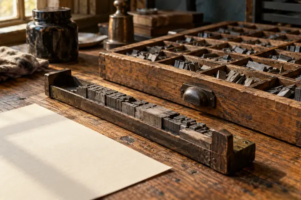
Serifs are the small strokes at the ends of letters. In a 2005 study they made no difference to reading speed.
See the study doodlefont
A PLAIN-ENGLISH GUIDE TO TYPE
What makes text easy to read is mostly not the little feet on the letters.
Try the size explorer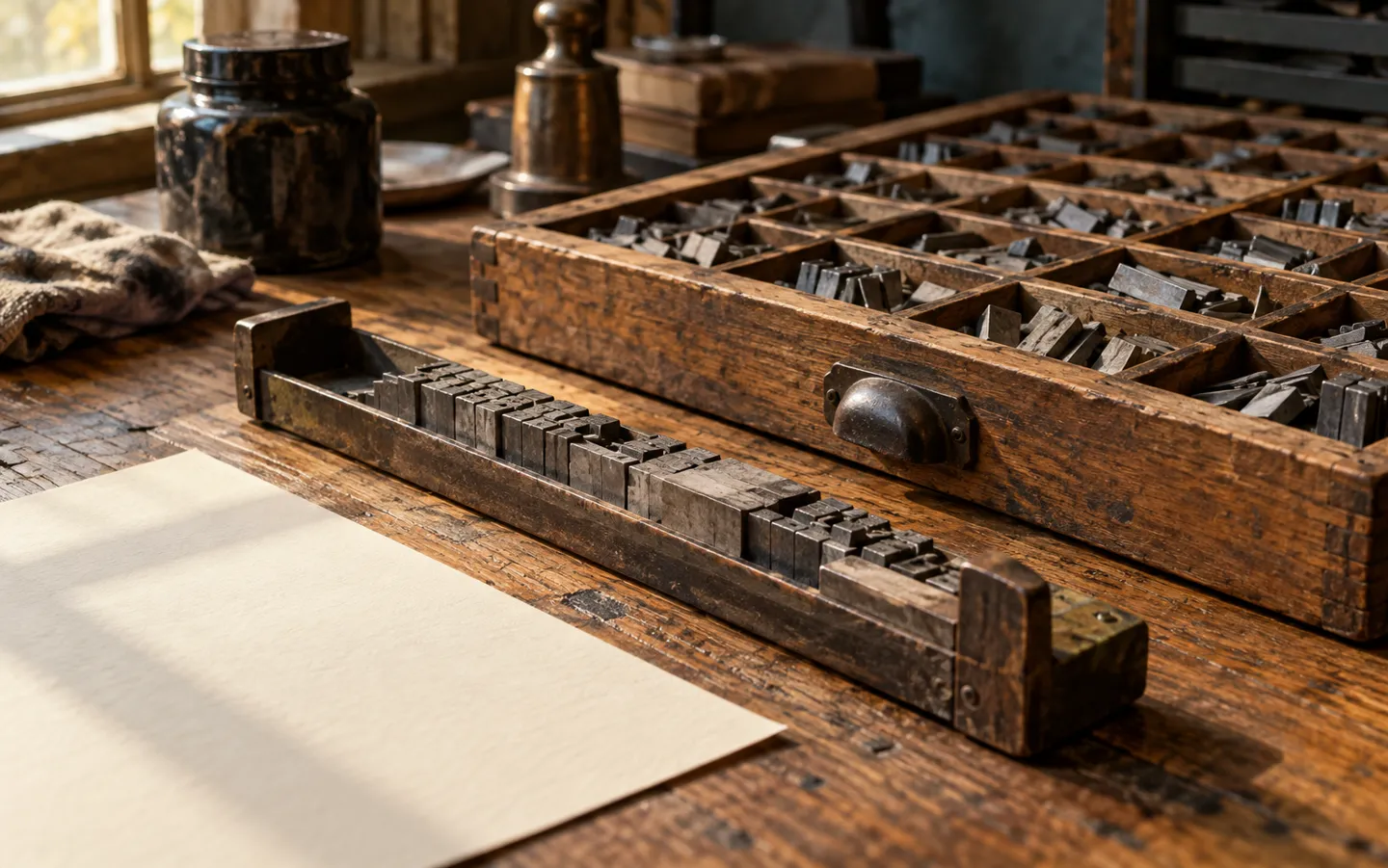
1 POINT= 1/72 inch
People argue about serifs. The evidence points elsewhere: how big the letters really are, how much room they get, and how the page is set. Here is what a typeface is, how big a point is, and what official guidance says about readable text.
Plain English, with the sources linked.
Updated
THE SHORT ANSWER
Serifs barely change reading speed.
Size, spacing and layout do the heavy lifting.
SERIF VS SANS
Serifs are the small strokes at the ends of letters. In a 2005 study they made no difference to reading speed.
See the studyTHE POINT SIZE
So 12 point is one sixth of an inch. It measures the body of the type, not the letters you see.
Try the sizesEASIER TO READ
Accessible text needs enough size, spacing and plain setting: left-aligned, sentence case, no long runs of italics.
Four habitsA POINT SIZE EXPLORER
Pick a size to see a sample line set in it, with what that size means in inches and millimetres and where official guidance puts it.
Screens vary, so treat the sample as a guide. The point itself is fixed: 72 to the inch, by the definition web style sheets use.
TWO THINGS WORTH KNOWING
Where movable type took off in Europe,
and what a lab found about serifs.
About 180
Gutenberg Bibles printed
Gutenberg's Bible was the first book printed with movable metal type in Western Europe: about 145 copies on paper and 35 on vellum. Movable metal type had been used in Korea nearly a century earlier.
MAINZ · ABOUT 1455
None found
Effect on reading speed
A Vision Research study compared versions of one typeface that differed only in their serifs. Reading speed showed no effect, and legibility changed only slightly at tiny sizes. Letter spacing mattered far more.
SERIFS · 2005
The lesson from both: the shapes have changed less than people think, and how much space the letters get matters more than their decoration.

MAKE IT READABLE
GOV.UK guidance gives 12 points as the minimum for documents. Go to 16 or more for large print, 18 or more for posters and slides.
Whole sentences in capitals are harder to read, because the letters are harder to tell apart. Keep italics for short phrases.
Justified text creates uneven gaps between words. Left-aligned text keeps the spacing even and the reading smooth.
Leave space between lines and paragraphs, and avoid very long lines. The ONS suggests 75 to 120 characters per line as comfortable.
TYPE FACTS
The typeface is the design. A font is one version of it, such as the bold or the italic. In metal type, each size was a separate font too.
Web style sheets define 1pt as 1/72 of an inch, so 12 point is one sixth of an inch, or about 4.2 mm.
Point size measures the type body, not the letters. The height of small letters like x, the x-height, varies between typefaces; style sheets even have a unit for it.
A 2005 study found no effect of serifs on reading speed. Any legibility effect appeared only at very small sizes near the limit of sight.
The web accessibility standard WCAG 2.1 says text must still work with line height at 1.5 times the font size and paragraph spacing at twice the font size.
QUICK QUESTIONS
Short answers to the questions people ask most.
A typeface is the design: the shared look of a family of letters. A font is one particular version of it, such as the bold or the italic, and in the days of metal type, one size as well. In everyday use the two words are often swapped.
For ordinary printed text, research suggests the difference is tiny. A 2005 study in Vision Research found no effect of serifs on reading speed, and only a very small effect on legibility at sizes near the limit of sight. Size and spacing matter more.
A point is one seventy-second of an inch, so 12 points is one sixth of an inch, about 4.2 mm. That measures the body the letters sit on, not the letters themselves, which is why two typefaces at 12 point can look different sizes.
The x-height is the height of the small letters without ascenders or descenders, such as x, a and o. A typeface with a larger x-height tends to look bigger at the same point size. Web style sheets even have a unit for it, the ex.
No. His Bible, finished in Mainz in about 1455, was the first book printed with movable metal type in Western Europe. The Library of Congress notes that movable metal type was used in Korea nearly a century earlier.
A NAME WITH CHARACTER
doodlefont.com is part of the DoodleSale portfolio. It isn't in an auction right now, but you can ask about leasing it.